In the world of hyper-casual creatives, an essential way to make your gameplay stand out to users, improve clarity, and lower CPI is using the right colors. This doesn’t just mean choosing an appealing palette - it’s also about making sure contrast is high and you’re tapping into player psychology, among other things.
So here, Lolita Snopkova, Director of Creative Operations at Supersonic who has helped grow games like Bridge Race and Tall Man Run to the top with her creative expertise, shares her top six tips for using color in your creatives.
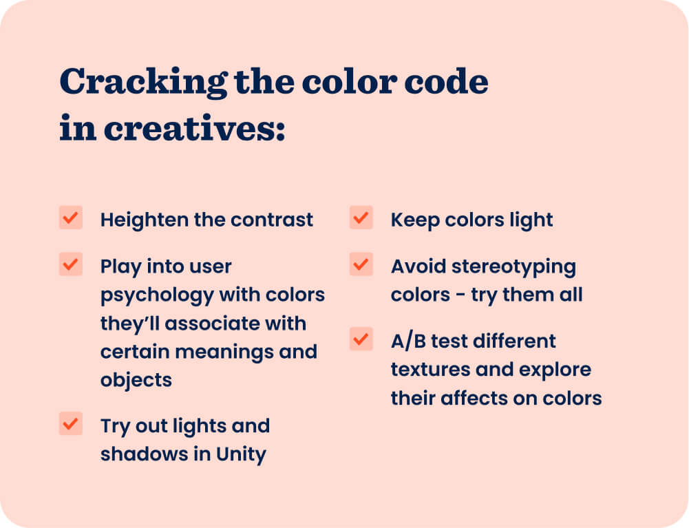
1. Increase color contrast to make the gameplay more clear
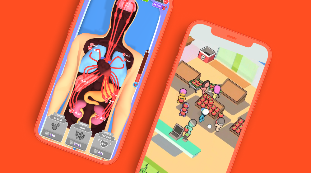
No matter the genre of your hyper-casual game, enhancing contrast in your creatives through color is key. Contrast makes gameplay easier to understand and indicates to users where they should look so they’re focusing on the right parts - like the character running or collecting tiles to build a bridge. Generally, using blue or green as the background color and yellow or blue for characters tends to perform well in creatives and heightens contrast to make elements stand out.
For example, early versions of creatives for our hit game Tall Man Run showed a blue runner character on a blue background with blue gates. Though blue is a popular color for hyper-casual creatives, using too much blue caused a lack of contrast.
Changing the creative so the character was orange and the gates were red and green heightened contrast - and in doing so, made gameplay more clear. As a result, the second version lowered CPI by 40%.
2. Use colors with common associations
Another way to make your creatives more clear and understandable is to use colors that players commonly associate with certain meanings. Use red to indicate enemies or obstacles to avoid, or yellow as safety zones because this is what players would expect - at a glance, they have a better understanding of your game and how they should play.
Use colors that players commonly associate with certain meanings so at a glance, users have a better understanding of your game and how they should play.
When designing creatives for Giant Wanted, a version featuring a red giant outperformed one with a yellow giant. Why? The goal of the game is to shoot the giant, so positioning him as the enemy in red made more sense to users - red is the color of danger, while yellow indicates safety. Tapping into this little bit of player psychology and turning the enemy red helped lower CPI by 35%.
Using colors usually associated with an object’s usual color is important for improving accessibility, too. The hyper-casual audience is everyone - make sure to appeal to all users with simple color associations that help them understand the objects in your game more quickly, like using green for forest, blue for water, and yellow for desert. For Tall Man Run, testing creatives with different colors for the trees and ground proved that using natural green hues (as opposed to unusual purple tones) performed better - the version with green trees had a 35% lower CPI.
3. Avoid darker colors in either the entire theme or part of the creative
Hyper-casual creatives tend to perform well when they have bright, cartoonish colors. Meanwhile, darker colors - like black or brown - usually increase CPI. So lighten up your creatives and either change the whole theme to a lighter color or just a single element, such as the environment or character.
A version of a creative for Pro Builder used a theme that included darker colors, like brown and purple, that didn’t have much contrast between them. By designing a new version with lighter colors and higher contrast, CPI reduced by 38%.
The same idea applies to a specific element in a creative, like in this example where the dark navy background of Tall Man Run was swapped for a lighter blue. As a result, the version with the light background had a 50% lower CPI than the one with navy.
4. Try testing feminine colors
Many developers avoid using what’s commonly known as “feminine” colors, like pink and purple. But we’ve seen that these colors have actually performed best in many creatives across all types of hyper-casual games. Get past the stereotypes often associated with certain colors and try them out in your creatives.
For example, versions of creatives for Stacky Dash that used pink were consistently the top performers - they decreased CPI by 37%.
In fact, the KPIs from this creative were so good that a pink board was implemented in the first levels of the actual game, which led to a significant boost in D1 retention.
5. Explore lighting and shadows in Unity
Lighting, shadows, and saturation affect how colors appear to our eye. When you build your game in Unity, you can play around with these features to make gameplay easier to understand and have the elements of your creative pop more.
While building creatives in Unity for Escalators, we worked on designing versions that lightened the colors used in the game, which had a darker appearance. These brightly lit creatives, which enhanced contrast, gave it a more bright and cartoonish appearance than versions using the colors from the original game - and made the entire creative more clear. As a result, the lighter version lowered CPI by 30%.
6. Play around with textures
The texture of an object or element in your creative can also affect its coloring, like whether it’s 2D, 3D, feathered, etc. If the object is 2D and simple with no shading, for example, it’ll have one flat color, but if it’s 3D modeled, it’ll have different shades that create a realistic appearance.
There’s no one size fits all approach - you should A/B test different textures in your creatives to see which performs best. But keep in mind that the textures should still maintain normal associations so users immediately recognize it and understand the creative.
Textures should maintain normal associations so users immediately recognize it and understand the creative.
In the case of Tall Man Run, using a metallic-looking texture for trees in a version of the creatives had a higher CPI than one featuring a natural leaf and wood texture. The version with the normal-looking tree texture had a 12% lower CPI, in fact.
Clarity, clarity, clarity!
We said it before and we’ll say it again: clarity is key to creative success. When your creative is clear and easy for users to understand, it’s the best way to lower CPI, set your game up to scale, and earn a profit.
Use the tips above to play with color in your creatives so you can make it stand out and ensure users understand your game at a glance. And keep testing new versions to unlock scale and continue optimizing performance. For even more creative tips, check out this webinar with Lolita and Darya Ipatova, Motion Designer Lead at Supersonic.
Let's put these tips to good use
Publish your game with Supersonic