Why did we dedicate an entire SuperMonday webinar to creatives? While they may seem simple, creatives can have a big impact on your CPI. We want to keep you in the loop with tips and tricks to take your creatives to the next level.
Lolita Snapkova, Director of Creative Operations at Supersonic, and Darya Ipatova, Motion Designer Lead, shared some do’s and don’ts when it comes to designing effective creatives. They’re experts at managing performance-based UA campaigns - in fact, their team produces over 4,000 unique creatives each month. Watch the full webinar or read the highlights below, where they’ll walk you through their best practices for prototyping your game with a data-driven approach to creatives.
Best practices for killer creatives
Gameplay
For hyper-casual creatives, choosing the right gameplay to show is key. You want to choose a snippet of gameplay that clearly shows the game’s mechanics, controls, and goal. If users can summarize your game in 1 sentence after 5 seconds, your creative is in good shape.
It’s also important to emphasize the actions shown in the gameplay with significant visual changes. Showing bonus levels or collecting coins and diamonds can be satisfying for users, but it’s better to concentrate on the game’s main mechanics. For example, the most effective way to engage users is to clearly show them how much progress they made, or how much the main character developed.
Colors
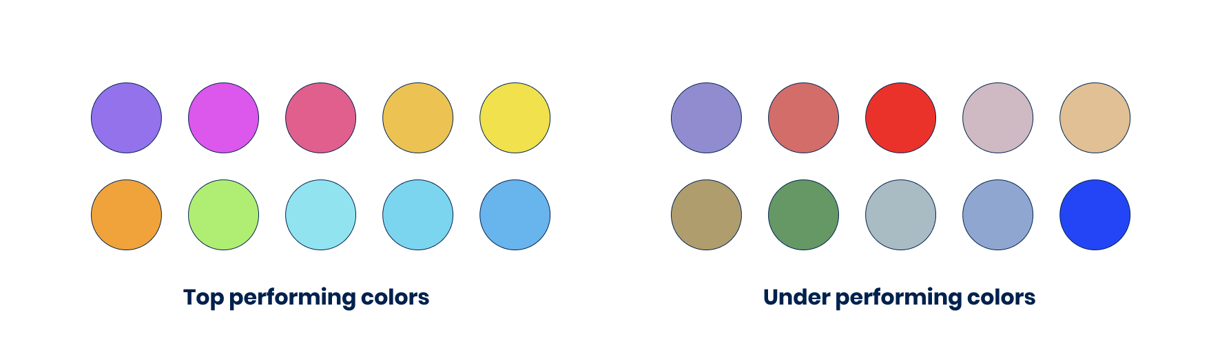
To reach the broadest possible audience and get high marketability, it’s best to use bright, cartoonish colors - as using dark or “dirty” colors might narrow your audience. We’ve found that brown and red, for example, aren’t as attractive to females. Top performing colors are definitely not the only option, but it’s something to keep in mind as you test out what looks best for your game.
It’s very important to keep the contrast high between key elements in the game, like the main character, obstacles, enemies, and background elements. Using color associations is helpful here too - using red for the enemies clearly indicates danger. In this example, maintaining a high contrast helped reduce CPI by 23%.
Looking at some examples, we saw that making the colors a bit brighter and increasing the contrast between the background and character helped reduce CPI by 38%.
In the second example, we tried to make the colors more cartoonish and use associations to appeal to users. Since the main character is a girl, we made the car pink. With these changes, we reduced the CPI by 21%.
Camera
We recommend using a zoomed-in camera angle to bring the user’s attention to a single action. If there are too many objects on the screen, the user may not know where to look and miss the main mechanics of the game. Zooming in will help focus the user’s attention on the action you want to highlight.
Trying different camera angles can also offer a new gameplay experience and improve clarity. But switching up the camera position isn’t always necessary and depends on the game - so be sure to consider carefully whether it adds value to the experience. Usually, changing up camera angles works best for idle games or runners, not puzzle games.
Character position
When it comes to character position, always place your character in the “playable zone” under the users’ fingers, not in the center of the screen. This sounds minor, but it’s an important tip to improve your video creative.
Aspect ratio
Many publishers use Facebook for their initial tests and iterations. When you screen record your game, be sure to make the ratio 4:5 to prevent Facebook from incorrectly resizing it. Otherwise, Facebook’s auto-adjustment might distort the visuals on users’ phones. Keep in mind that you don’t have to use a black or blurred border when resizing your game. Instead, it’s better to simply zoom in on the game, as long as you don’t cut off important game elements.
Questions we receive often from developers
Since Lolita and Darya work with developers all day long, they’ve answered tons of questions. Here, they summarize some of the most common questions about designing creatives.
Should I add a hand?
Yes, if it clarifies the game controls and focuses user attention on the correct elements (usually in puzzle games). In fact, we’ve seen CPI’s decrease by 15-20%. The hand can be cartoon or realistic - it’s more about the value the hand brings to the experience than the visual appearance.
No, if the mechanic is easy to follow without guidance from a hand, like in runners. In some games, it could even steal the spotlight and distract users, which might increase CPI.
Do I need to add a call to action (CTA) button?
No, tests on various types of games showed that you really don’t need a CTA button during or after your video. In fact, here’s a quick history lesson: CTA buttons originate from a time when ads were based on animated cartoons instead of showing actual gameplay. The animations made it hard for users to understand what was being advertised, so it was important to highlight the fact that it was a downloadable game and not just a cartoon. In today’s hyper-casual industry, it’s clear enough that the ads are for games, so there’s no need for CTA buttons.
Additionally, on Facebook and TikTok, videos aren’t clickable at all, so a button wouldn’t achieve any engagement. Both platforms add real buttons below the videos instead.
Should I test different visual effects?
No, experimental visual effects don’t necessarily lower the CPI. To find an effect that will decrease CPI by at least 5%, you’d need to test hundreds of them. But in early prototype stages, ad space is usually limited. So, it’s more worthwhile to focus on bright colors with high contrast and leave experimenting for when the game is published.
Do I need to test different environments?
For hyper-casual games, environments just need to make sense within your game universe and support the mechanics. They shouldn’t steal attention or prompt questions from the users. We recommend sticking with something plain like a forest, city, or even a solid color background.
The type of environment itself is not super important - it’s more about how the scene looks and lives within your gameplay. Remember, bright colors and high contrast work well in hyper-casual games, so keep that in mind as you set up your background.
Do I need to test icons?
No, there’s no need to conduct A/B icon tests at the prototype stage - focus on your prototype instead. Leave ASO tests for more advanced stages after you’ve scaled for a greater effect.
When it’s time to focus on the icon, we’ve found that it’s beneficial to exaggerate elements in the icon so they’re easy to see on a phone screen. The other aspect of icon design that’s important for improving CVR is its relevance to the gameplay, so don’t be afraid to show your core mechanic in your icon. Otherwise, if you stick with the creative best practices we discussed earlier while designing your icon, you should be all set.
Case Study: Tall Man Run
We want to highlight a recent launch, Tall Man Run, because it highlights the importance of thinking outside of the box and coming up with multiple ideas. The game has been at the top of the charts for a couple of months now, and the number of installs has been increasing incrementally each day.
In creatives, the two main things to notice are the gameplay and the mechanic. In Tall Man Run, gates define the mechanic. We decided to focus on that aspect and zero in on how to make the mechanic even more understandable, satisfying, and clear.
On the left, there are some parts of the gameplay that are unclear. First, there’s no clear or satisfying gain or loss effect. It’s also difficult to understand how to navigate the gates. Are users supposed to run through the gates or skip them? There are also changes after running through the gates that aren’t clearly good or bad. Do users want to grow taller? Will that make it harder to pass obstacles?
We got to work on this ad. The most important change was focusing users on the gain and lose mechanic by dramatizing the impact of each gate. We also made sure that the gates weren’t skippable so it’s clear that users must choose which side to run through. We used simple associations to help with decision making - green is safe, red is dangerous. The associations help users understand which side they should pass, and different icons or emojis can reinforce that decision. With these adjustments, we achieved over 40 million installs in 2 months.
The main takeaway from this case study is to stay open minded when trying out different visuals. Creatives seem simple, but they have the power to make drastic, positive changes in your prototype.
Too long; didn’t read - Highlights
DO:
- Focus on the core gameplay
- Use bright colors and high contrast
- Stick with broad themes as your background - think city or forest
- Add a hand in puzzle games
- Think outside the box and test multiple gameplays and visuals
DON’T:
- Record bonus levels or side mechanics
- Use dark colors or low contrast
- Use specific or “narrow” background themes like space, sci-fi, or horror
- Add a hand in runners
- Waste time on testing visual effects, real-life footage, CTA, and ASO
Let's put these tips to good use
Publish your game with Supersonic