Your hyper-casual game concept could be fantastic and your visuals could be beautiful, but your game’s profitability and scale comes down to creatives. If your creatives don’t attract users and have a low CPI, it will be extremely difficult for your game to climb the charts affordably and quickly.
So Lolita Snopkova, Creative Team Lead at Supersonic, who sees a few thousand creatives go through the studio each month, is sharing her tips for building hyper-casual creatives that lower CPI and help you unlock scale.
The basics at each step of the user funnel
What’s the most important rule to create great creatives? While there’s no single secret to success, a piece of general advice is to think of your creatives like a game - but instead of 1000s of playtime, it’s 30 seconds.
Users go through a similar funnel watching an ad as they do playing a game. Both creatives and games start with the visuals, which aim to engage players in seconds. Then there’s the gameplay, which shows users the mechanics and goal of your game. Lastly, there’s the emotional aspect, or the feelings users get when watching your ad or playing your game. You need to have it all - great visuals, clear gameplay, and tap into the right user emotions - to achieve a low CPI. Let’s talk about best practices at each stage of this funnel to make sure your creatives are hitting the mark.
Visuals
Your creatives need to have a contrast between the main elements of your game, like the characters and the background. This doesn’t mean ramping up the brightness or saturation - your creative just needs to stand out so users can quickly understand your game and get engaged.
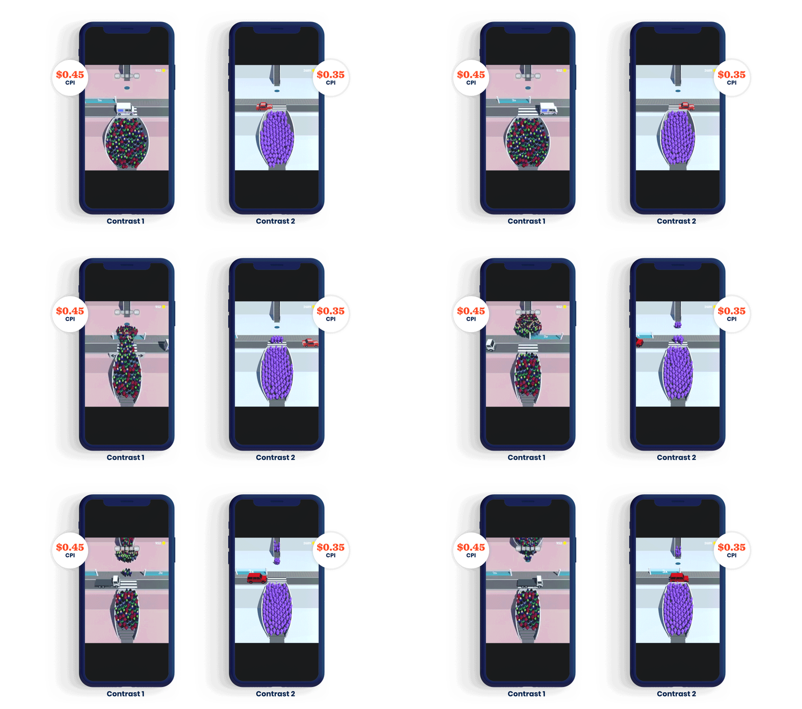
Using color associations from real life can help clarify the game mechanic to even the most inexperienced users. For example, red indicates danger - color the enemies or obstacles in your creatives red so players innately understand to avoid them.
Bright, cartoonish colors also help lower CPI. This color palette reaches a broader audience, which is crucial for success in the hyper-casual market where your target users are everybody.
Gameplay
Make gameplay and your game’s goal clear within five seconds of the creative - imagine yourself as a user who’s never played your game before. In this short time, you should answer burning questions, like:
- How do I play?
- How do I control the game?
- How do I win the game?
Try testing different gameplay scenarios in your creatives to generate different feelings and emotions from users. You can use the same elements, like skins and environments, but changing just the gameplay can be a quick fix that taps into player psychology and lowers CPI.
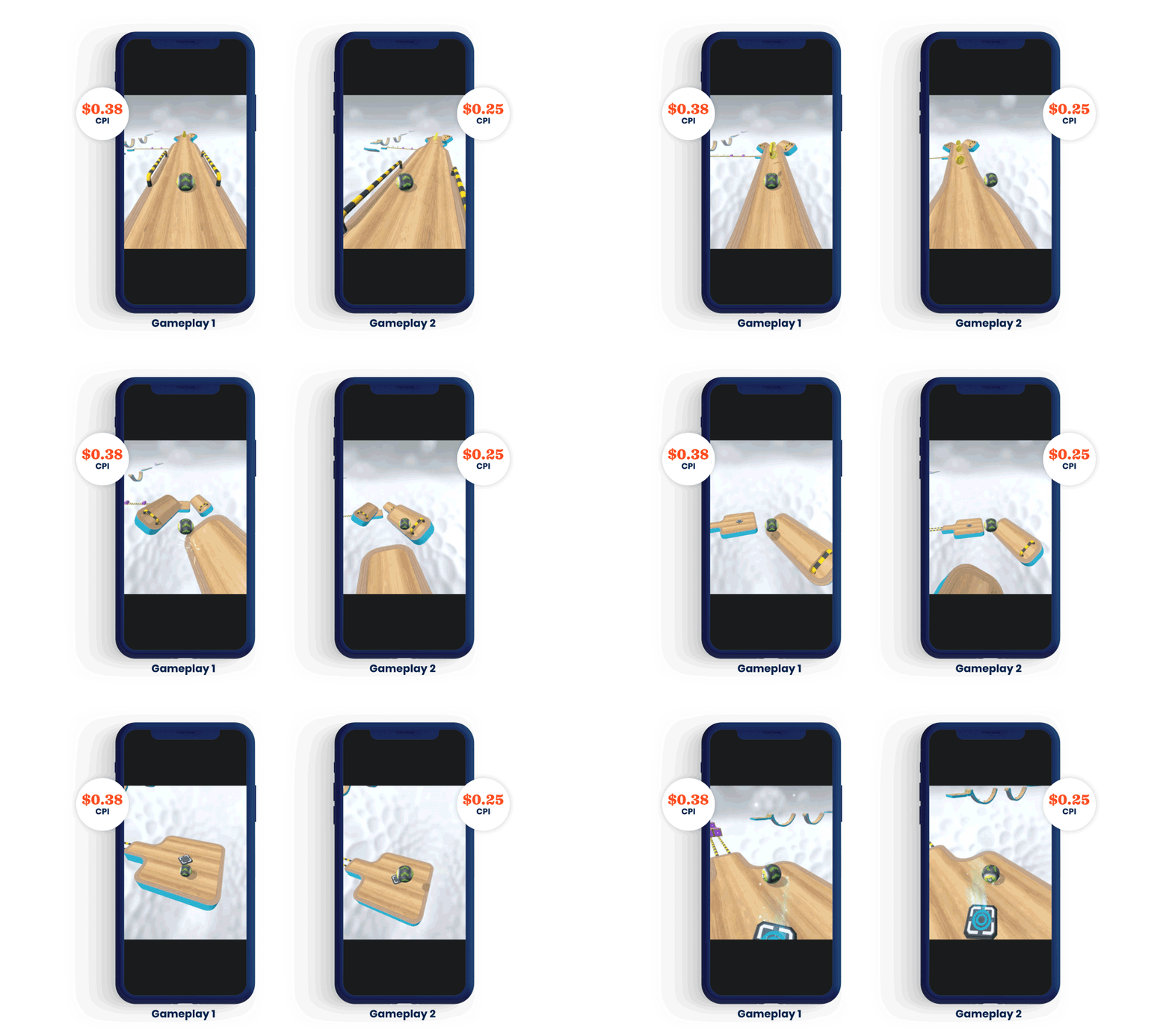
Be sure to depict characters in the “playable zone” - this is the area on the screen that users would be controlling the game. Showing the characters where users would be tapping, sliding, etc. to control them, makes your creative feel more immersive, accurate, and engaging.
Player psychology
Feature scenarios in your creatives that emphasize emotions - if it’s relevant for your game, use real-life scenarios that feel more powerful and relatable. Aim to tap into the strongest human needs, which include frustration, safety, love, and self-esteem/self-actualization (e.g. the desire to be an artist or an athlete). Showing a fail scenario in creatives is also an effective tactic to touch on these feelings and lower CPI.
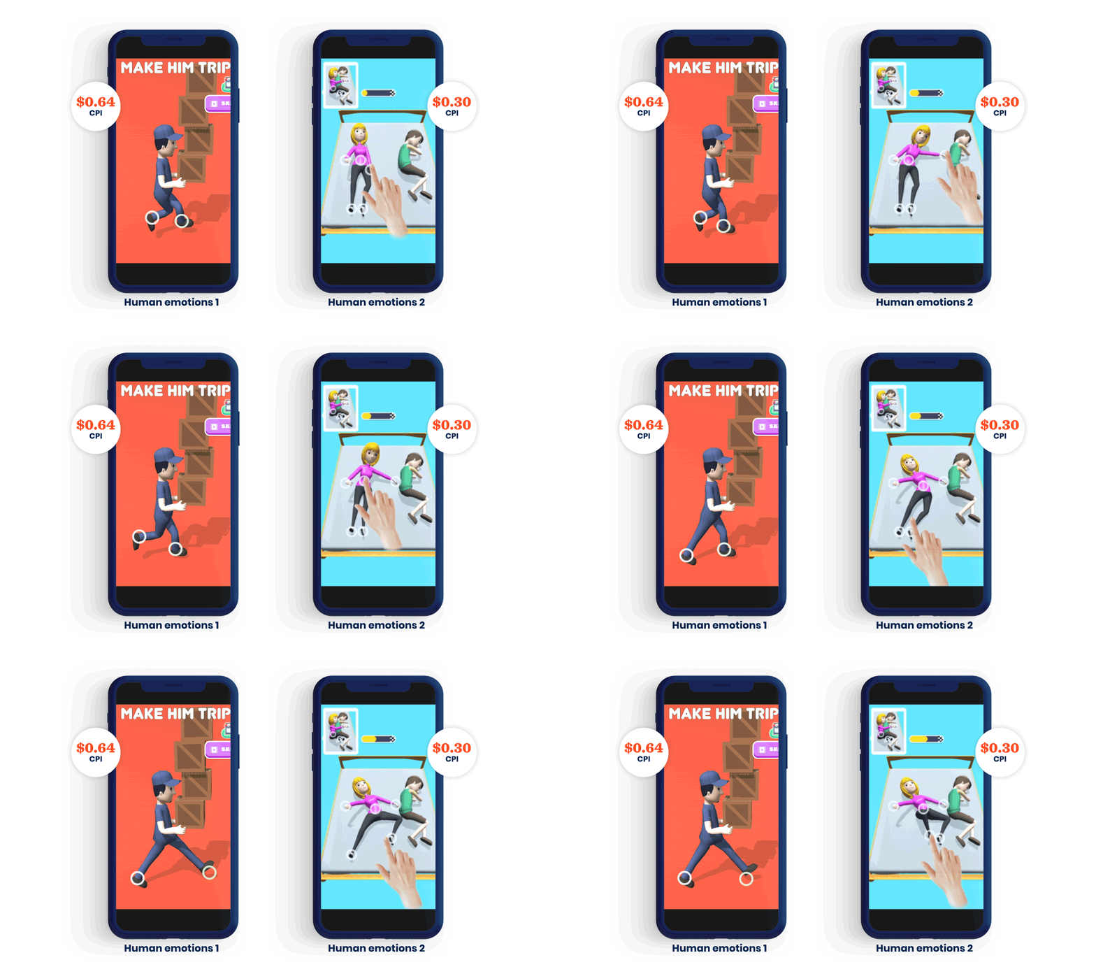
Try choosing common objects from real-life that users associate with human needs and feelings. For example, using food emojis in a hyper-casual puzzle game creative relates to the feeling of hunger and desire for that food.
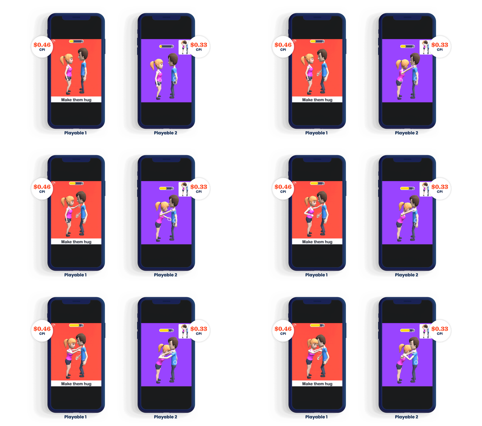
Also, make your creatives feel playable to give users an understanding of how they would feel playing your game and to tempt them to install. Take Move People (Make ‘Em) as an example - in an early version of the game’s creative, a couple is shown with the directive “Make them hug”. A later version shows the same couple and directions, but includes targets on the screen that feel like a more natural explanation of how to control the characters. This makes the experience more dynamic and emotional for users - they’re not just passive viewers anymore; they’re imagining themselves playing your game.
Thinking outside the box to keep lowering CPI
Your game’s creatives are essential for scaling up and lowering CPI, but if your game has a CPI over $0.50 even after hitting all the key points above then it’s time to go back to the drawing board - as it’s going to be next to impossible to lower CPI enough to scale affordably. But if your game’s CPI is around $0.50, follow these tips to decrease it.

Try a different camera angle
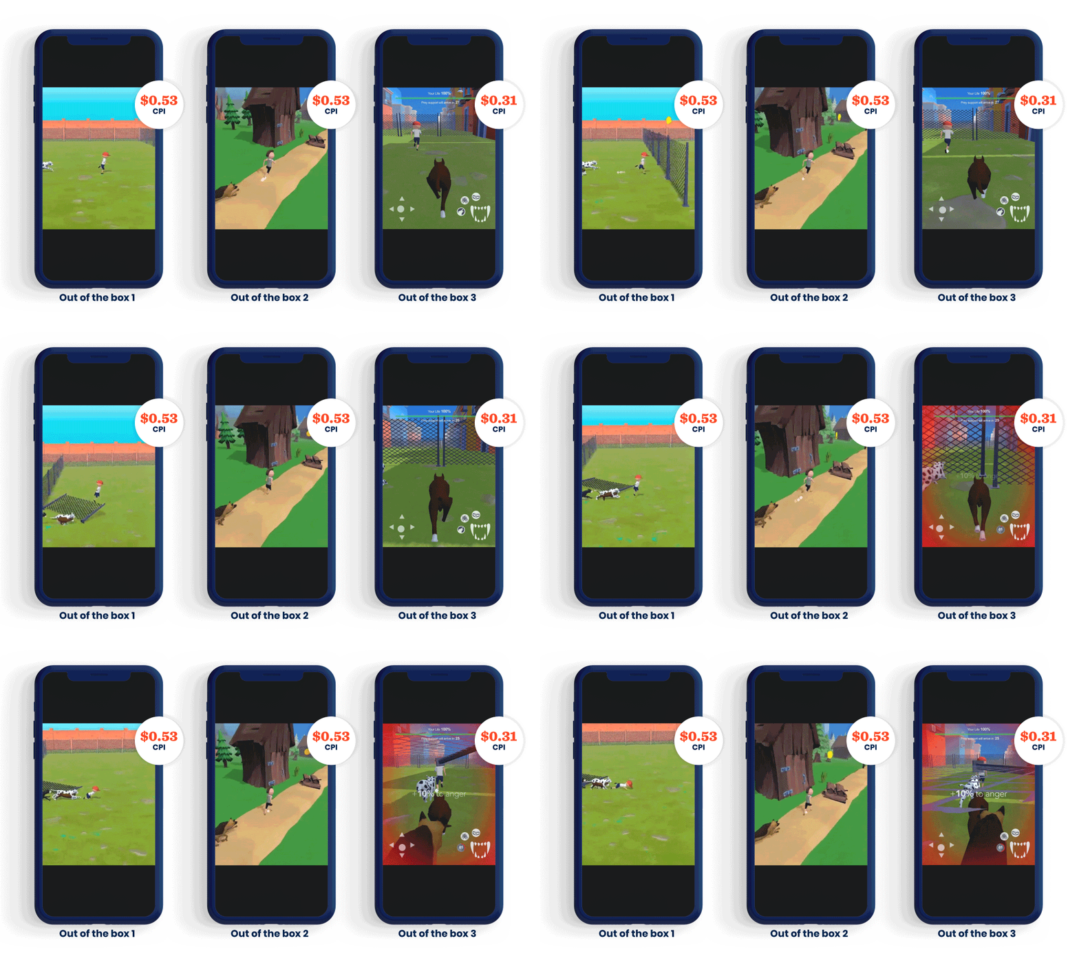
Different camera angles can give users a new experience that engages them more effectively and lowers CPI. Just make sure when you’re trying out new angles that you maintain clarity in the gameplay.
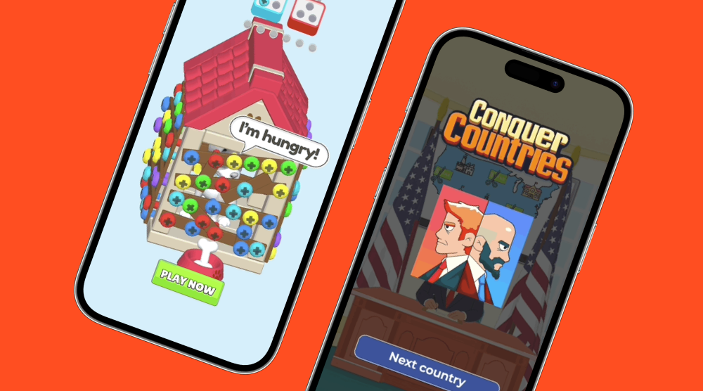
For the game Mad Dogs, we changed the camera angle and in doing so, changed the logic of the game. Placing the camera behind the dog in the game makes it seem like users are playing as the dog, though they’re still controlling the boy character. This camera angle makes the game feel more real without changing the mechanic. The success of this creative at lowering CPI led us to change the game build and implement a few levels that lets users play as the dog.
Use various themes
Different themes create different environments that attract new audiences. Test different themes in your creatives to see which lower CPI and reach a broader audience. If the winning theme has a particularly low CPI, you could integrate it into your build (like we did with the Mad Dogs example above) to boost in-game metrics.
You can also try testing new themes and new camera angles at the same time - mixing and matching can make a big impact on your game’s CPI.
Finding your hero creative
There’s not one special trick to designing creatives that lower CPI and unlock scale. You need to test your creative’s visuals, gameplay, and its ability to tap into user psychology to achieve the balance that helps you succeed. Iterating and continuously testing your creatives ensures you set your game up for maximum profitability and scale.
This article is based on Lolita’s presentation at SuperSessions 2021. Below, find the full video from her session:
Let's put these tips to good use
Publish your game with Supersonic
