Have you ever created what you thought was an awesome game only to see players drop before they have a chance to experience the magic?
If so, it may be time to take a closer look at your UX/UI design. Even the most brilliant ideas won't truly take off if the game is hard to figure out or if the menus and controls are confusing. For hybrid games, the stakes are high: you need the simplicity of casual design to hook players instantly, and the depth of core mechanics to keep them engaged long-term. That balance starts with UX/UI.
Here are 8 essential practices to make your hybrid game intuitive, satisfying, and impossible to put down.
1. Make sure design fits your genre
Every detail of your game’s design should reflect its genre and vibe. Think about it: the sleek, high-energy interface of an action RPG wouldn’t feel right in a calm, meditative puzzle game. Your color palette, fonts, icon style, and even the shape of your buttons all play a role in shaping the player's experience. When these elements work together, they set expectations, draw players in, and amplify the emotional impact of your game.
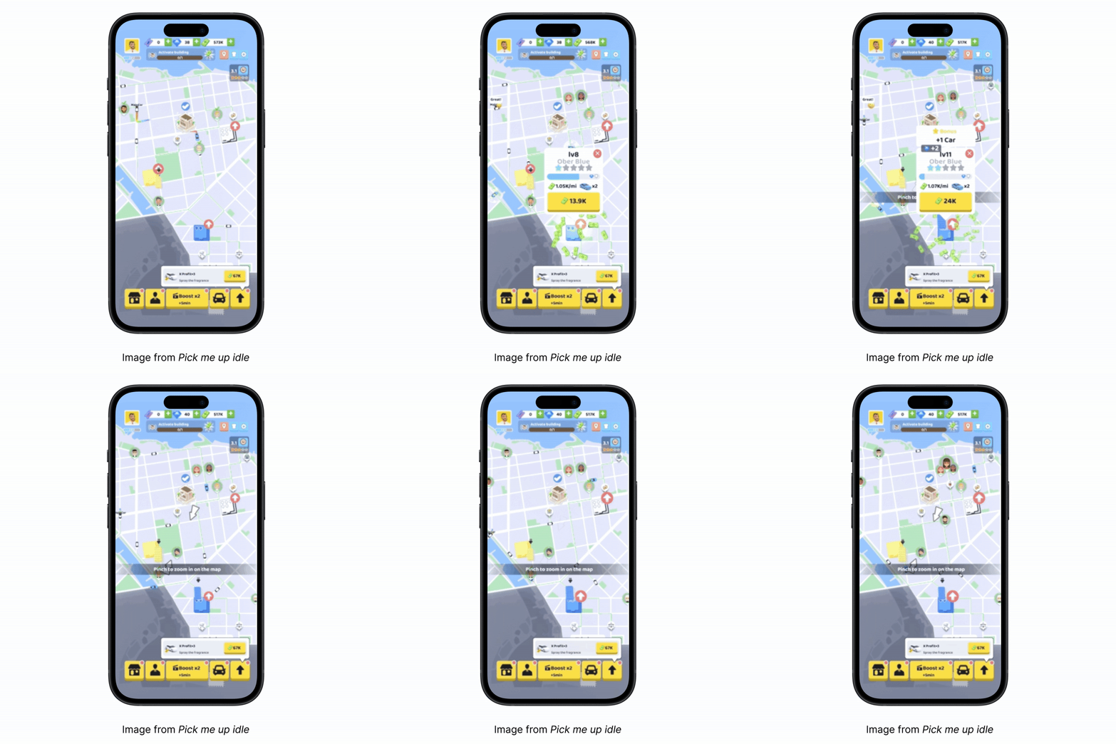
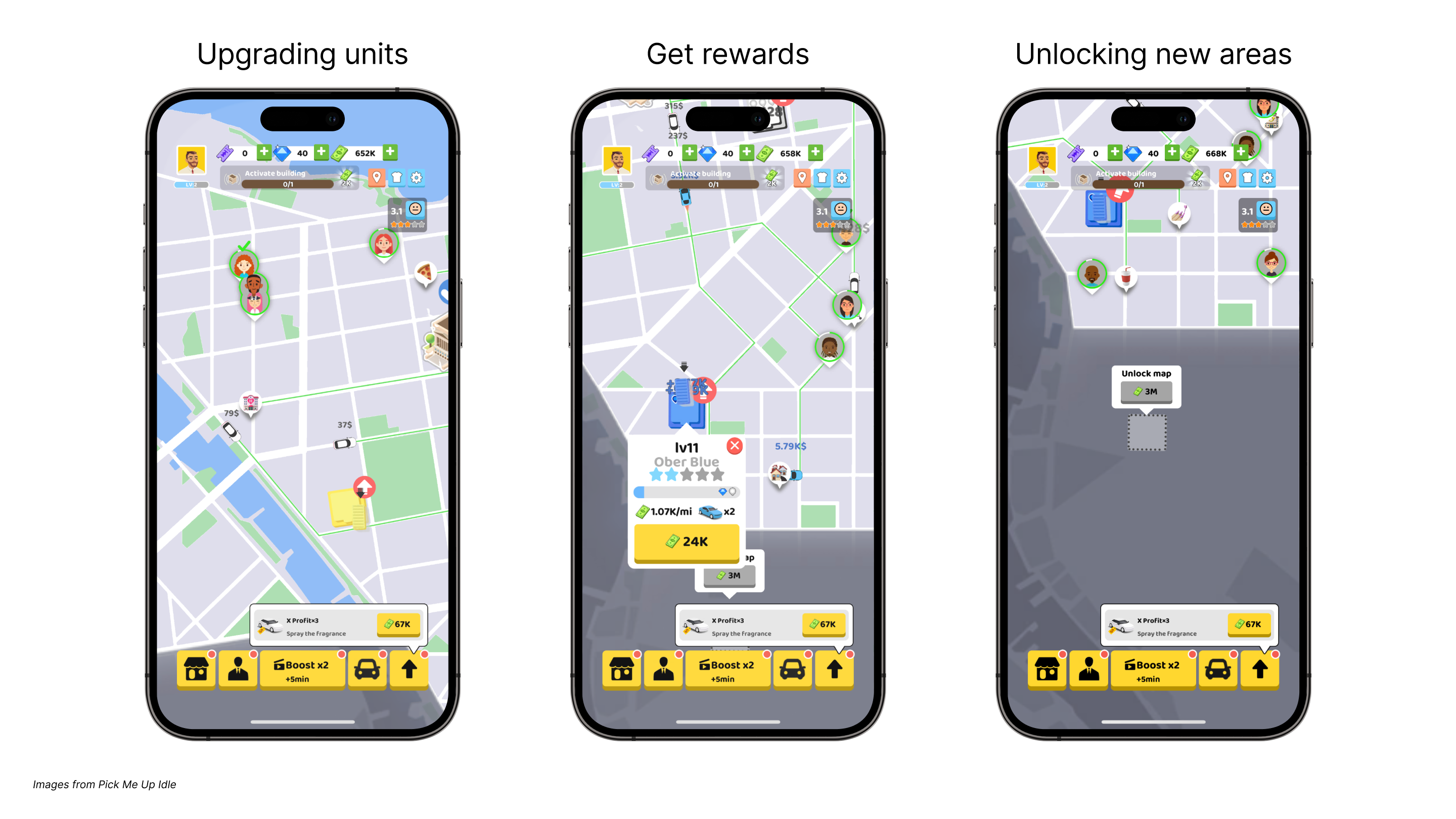
Take for example the UI and the buttons from the hit, Pick Me Up Idle. The look and feel of the map along with the contrasting yellow buttons make the player feel immersed in the world of a taxi cab business, bringing authenticity to the game.
2. Create clear tutorials
If you’ve ever been confused by someone bombarding you with too many details too fast, you know how your players will feel if you have too much going on in your tutorial. That’s why you need to make sure your tutorial is clear and straight to the point. Introduce game elements gradually, allowing players to practice and grasp core mechanics. All in-game text, buttons, and interactive elements should be distinct and functional. Most importantly, you should use concise explanations and visual cues to guide players and enhance their experience.
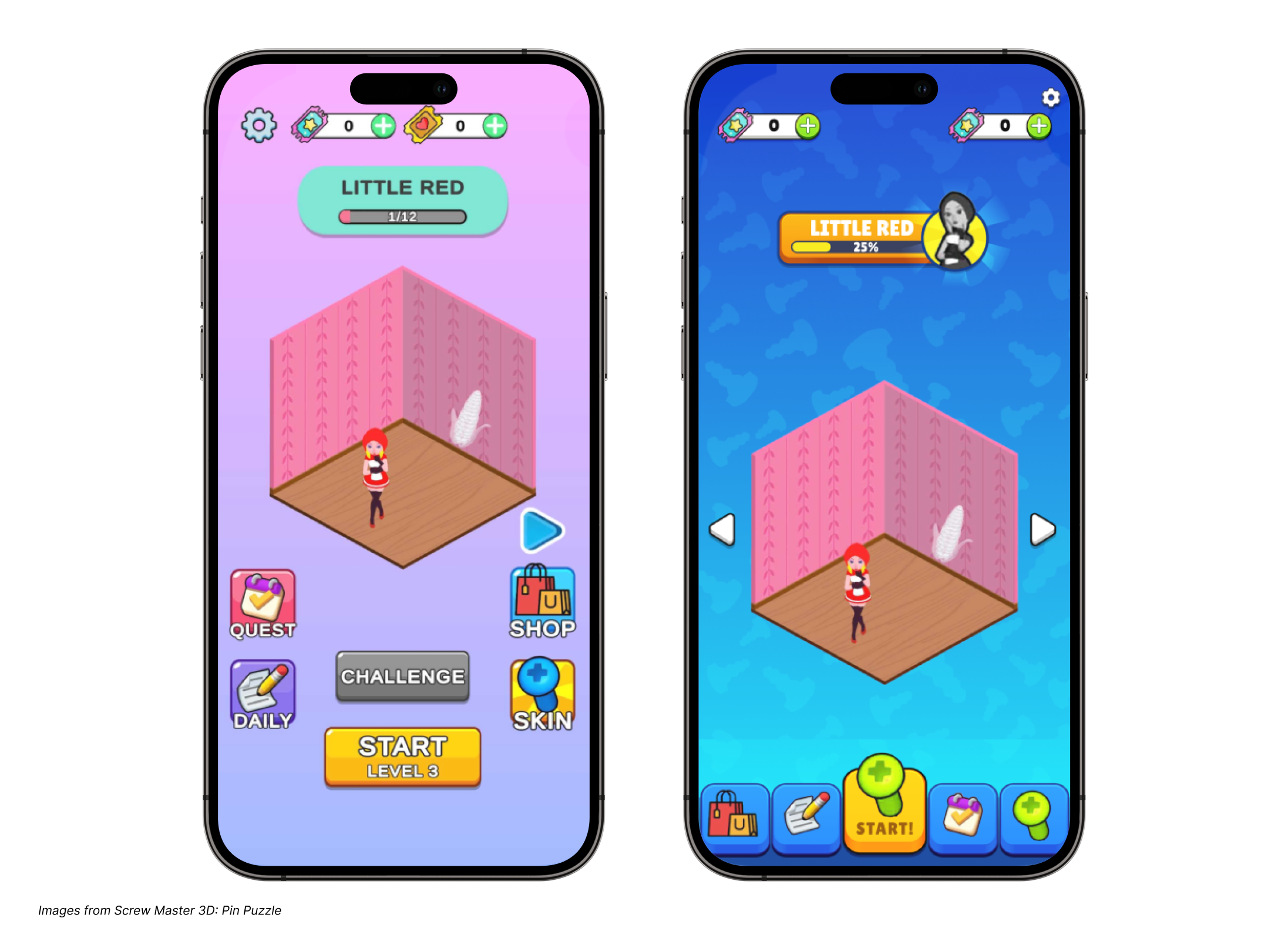
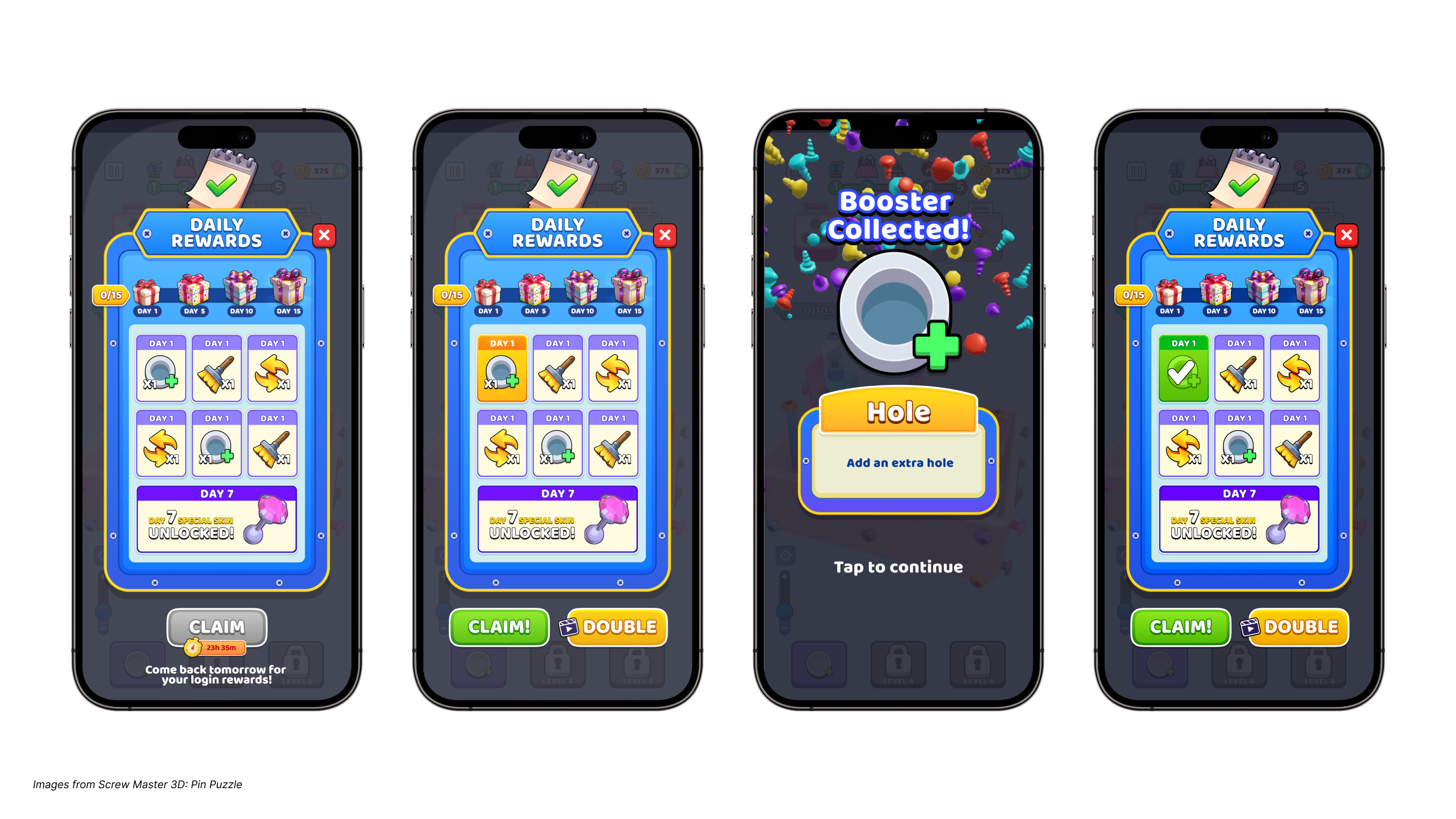
The example below from Screw Master 3D: Pin Puzzle illustrates this perfectly. As you can see, the buttons contrast with the background so they immediately standout. This ensures players can instantly see what they need accomplish first as they begin playing your game.
Finally, tooltips can also be super effective for teaching mechanics early without disrupting the experience, giving real-time information when players need it most.
3. Have a simple and intuitive UI
A cluttered or confusing UI can really ruin the experience for players. Your interface should feel clear, easy to use, and inviting right from the start. Tiny text, buttons that are hard to tap, awkward shapes, or busy screens can quickly lead to frustration and make people want to quit. Everything on the screen should have a purpose. Aim for simplicity and clarity: use contrast and layout to highlight what matters, guide the player's attention, and make interactions feel natural.
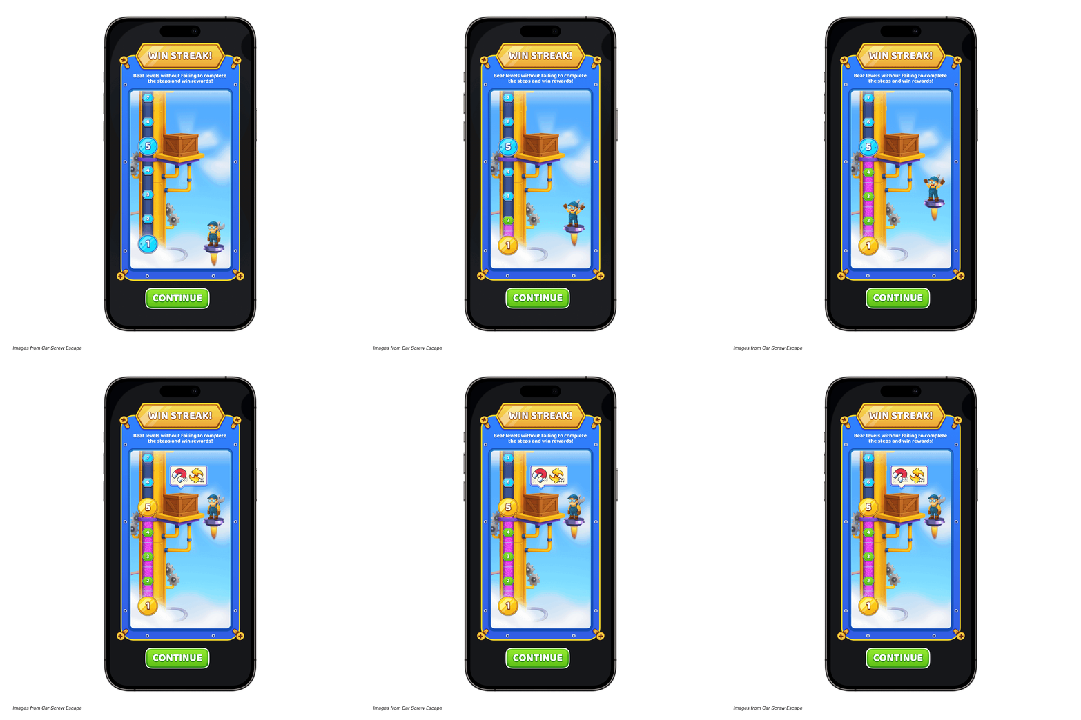
Take the UI from Car Screw Escape for example. It features a clean layout with strong contrast, clearly showing players what they need to do to progress and how close they are to earning their next reward.
4. Adapt the experience as players progress
As players start to get comfortable with the basics, that’s your chance to gently introduce new features and mechanics. Take it slow. Give them time to really get the hang of one thing before layering on the next. Smooth transitions help keep players in that sweet spot where the game feels fun and challenging, but not overwhelming.
For example, Pick Me Up Idle starts with a simple task of picking up passengers and upgrading stations to maximize profits. As players advance in the game, they’ll improve their station's efficiency and earn more currency. Only once this mastery has occurred, can they unlock new areas and expand their taxi cab business. Ultimately, players aim to grow their transport network, manage more cabs, and extend their services to multiple cities. The more they expand, the more they can increase their profits and enjoy the game.
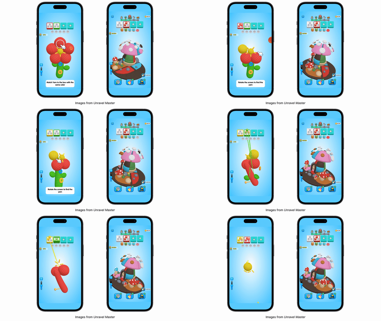
Another great example of this adaptability is showcased in our latest hit, Unravel Master. As a puzzle game with broad appeal, it skillfully caters to both advanced players and beginners. Unravel Master achieves this by introducing increased complexity for advanced players as they progress through the game. One standout feature is the x-ray option, which allows players to view the underlying layer of yarn beneath the existing one. This feature enhances strategic gameplay, enabling players to make informed decisions about which yarn to select, rather than relying solely on luck.
5. Optimize designs for each platform
What looks great on a smartphone might seem a bit empty on a tablet, so it’s important to tweak your designs to suit each device. Mobile games, for example, need tighter layouts with key actions placed where thumbs can easily reach them. Tablets, with their bigger screens, need a thoughtful approach to make sure the interface feels balanced and doesn’t have too much blank space. Keep an eye on font readability to ensure text sizes match the screen size, and make sure icons are easy to understand and the right size. Plus, all interactive elements should be easy to tap comfortably.
6 Use progress bars and daily goals
Players love feeling like they’re making progress, and great UX design taps into that. Things like progress bars and daily goals can be super effective for keeping players engaged and coming back. They show players what they’ve achieved and what’s next, which creates a strong sense of momentum. That said, don’t rush to add these features right away. Plan for them early in your UX design, but wait to implement them until your core gameplay is solid, your tutorials are working well, your in-game economy is balanced, and there’s enough content to support meaningful long-term goals.
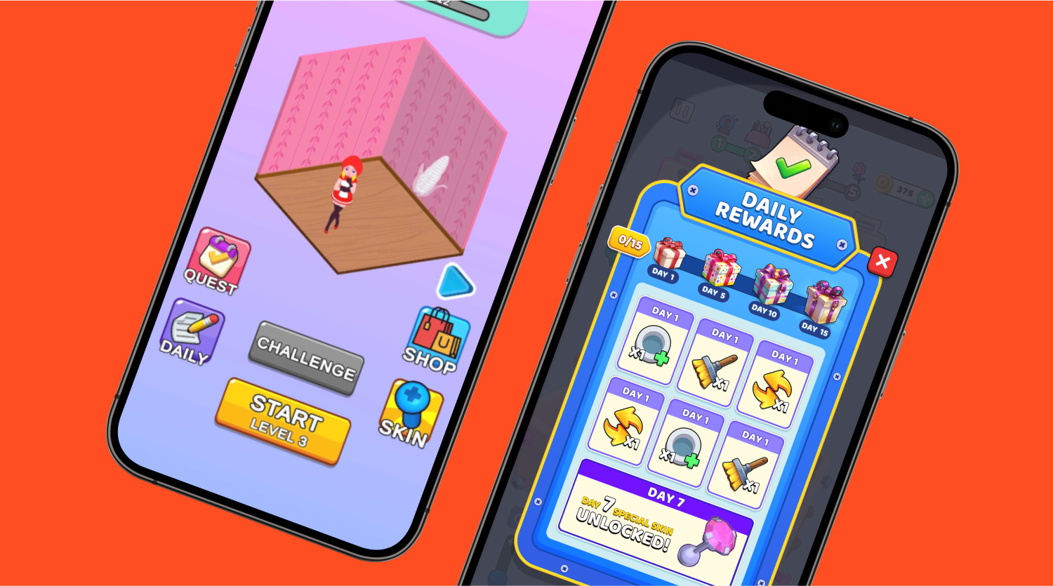
For example in Screw Master 3d: Pin Puzzle, you can see how they showcase the rewards the player will receive each day as well as the rewards they’ve already earned to keep players motivated and engaged.
7. Ensure your game is accessible
A great game is one that everyone can enjoy. That means thinking about accessibility from the start. For example, players with colorblindness might struggle if important info is shown only in red or green, so it’s a good idea to use additional cues. Giving players options like adjustable text sizes, remappable controls, or visual indicators for sounds can make a huge difference. It might feel like an extra step, but building in accessibility as you go helps keep your game inclusive and saves you from having to make big, time-consuming changes later on.
8. A/B test
Never assume you know what's best for your players. Just because a certain layout, button design, or onboarding experience is popular in another game or widely accepted as a "best practice," doesn't automatically mean it's the right fit for your specific audience and game. Always test different variations of your UI elements – from the placement of a button to the wording of a tutorial prompt. If something unexpected boosts engagement, retention, or conversion, embrace it, even if it goes against your initial assumptions.
Nail UX/UI for your hybrid game
Nailing UX/UI is about building trust and flow so players feel guided, rewarded, and immersed from the very first tap. For hybrid games, it’s this foundation that keeps players coming back day after day. Start testing tutorials, layouts, and accessibility features early, and let your players guide the way. After all, the right UX/UI is the bridge between your vision and your players’ long-term engagement. Ready to get started? Learn how to use a player-first approach to design UI tutorials that keep players engaged.
Let's put these tips to good use
Publish your game with Supersonic
