Playable ads are widely considered the most effective in-app ad format, according to eMarketer - likely because they build an emotional connection with the user and engage them in ways that a video creative alone can’t. Designed right, playable ads give users just the right taste of gameplay while leaving them wanting more, encouraging them to go to the app store and download the game.
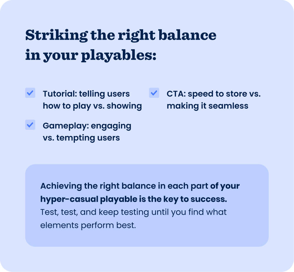
So what’s the trick to designing a great playable ad for your hyper-casual game? It’s no trick at all, actually - it’s about testing and analyzing the three main elements of playables: the tutorial, gameplay, and end card or call-to-action (CTA). Playable ads are usually used during global launch to drive users at scale and provide important insights into your creative strategy with in-ad metrics like engagement rate and conversion rate (more on that soon).
Asaf Prager, Creative Manager at Supersonic, shares his tips for optimizing each part of a playable ad based on real examples from his work to help you boost creative performance and unlock scale.
Hook users with the tutorial
The tutorial is the first part of your playable that users interact with, and it needs to strike the balance between informing users how to play and showing them. Hyper-casual games usually have a single mechanic - it’s very important that users understand the mechanic in your playable and what will happen once they start interacting.
At Supersonic, we often A/B test tutorials to find this balance between telling and showing, and to determine what’s engaging users most so they keep playing. For example, one of the most common tests we run is removing noise in the creative, like obstacles and background elements. This keeps the attention entirely on the gameplay and mechanic in the creative - the goal is for users to know how to play in under three seconds.
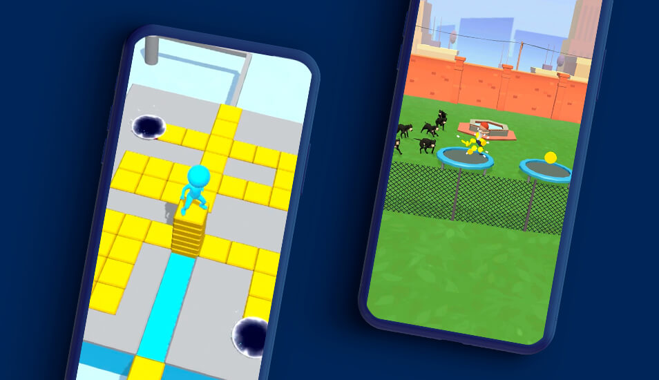
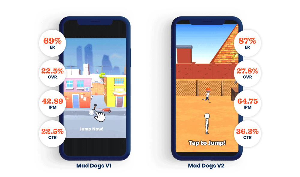
We tested this in a playable for Mad Dogs, by simplifying the background and changing the environment to be more bare. Then we changed the text so it related directly to the mechanic and made it more clear what happens when users tapped the screen. We also changed the camera angle to a full side view, which improved visibility and clarified gameplay even further. As a result, the new version improved performance across KPIs, achieving an engagement rate of 87%, conversion rate over 27%, IPM over 64, and click-through rate over 36%.
Tempt them with the gameplay in your playable
There’s another balance to strike when it comes to your playables, and it has to do with the gameplay: keeping users engaged vs. leaving them wanting more so they’re tempted to download and play. We suggest keeping your playable’s gameplay at 15 seconds or less, which is usually enough time to give users a sense of the gameplay experience while leaving them wanting to play more.
If your playable highlights actual gameplay from your game, try testing different elements to show. For example, you could test different levels with different difficulties and see which performs best in a playable. The playable gameplay that’s likely to resonate with users varies for each genre - for example playables for decision-making games often highlight the visuals and storyline more than other genres.
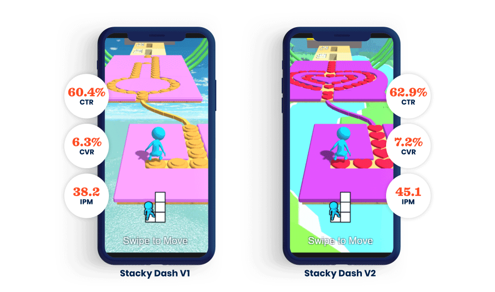
For Stacky Dash, we tested two versions of a playable featuring similar gameplay, but with distinctly different visual experiences. One version featured a track with coins and a circular formation. The other version had hearts instead of coins and the track was in a heart shape - the heart is a very familiar shape to users and they immediately understood and related more to the game. In the end, the version with the heart tiles achieved better results, bringing CTR up to nearly 63%, CVR over 7%, and IPM over 45.
Close the deal with the end card or CTA
The last piece of the puzzle: getting users to go to the app store and download your hyper-casual game. The balancing act here is avoiding irritating or startling users in how you send them to the store. The key is to get them there as quickly and with as little friction as possible, so test different ways you send users to the store from your playable. Some variations we test include using a simple end card that they can tap to go to the store or offering them an incentive, like getting an extra life when they install and start playing.
Find your balance
Put yourself in the mindset of users who see a playable ad during their game - they want to return to the game they’re already playing, but their full attention is on your creative until then. Your playable should take advantage of this focus and tempt users to install your game by giving them a short and clear experience that leaves them wanting more - aim to create a FOMO effect that makes users want to keep playing. Every hyper-casual game is different, and you should test many new concepts and variations of your playable ad to determine what maximizes scale.
Let's put these tips to good use
Publish your game with Supersonic