The secret to great art for a hyper-casual prototype? Clarity. How your game looks is essential for making sure it’s clear and easy to understand, which helps you confirm more quickly if it has marketability power - prototypes that show the mechanic, goal, and hook clearly tend to have a lower CPI.
Here, Eli Rabinovich, Art Designer at Supersonic, shares his best practices for art in hyper-casual prototypes and uses both outside examples and ones from his own portfolio of launched games.
1. Make your characters pop
In the prototype phase, the goal is to prove your concept has potential based on its CPI - start simple and focus on contrast and placement. Only after you confirm the CPI is low enough should you start developing a certain look or theme for the characters in your game. I suggest using Unity assets as a starting point - they have a large selection of free and affordable assets that can save you valuable time when designing your prototype. For even more time- and resource-saving game development tips, check out this blog.
"In the prototype phase, the goal is to prove your concept has potential based on its CPI, so start simple."
Put them in the playable zone
Players should know at first glance who they are in your game. This means placing them correctly on-screen and making sure they contrast with the environment. What we call the “playable zone” is the area under users’ fingers where they control the character - it’s usually the lower third of the screen. Show characters in the playable zone to make it clear who the users are in the game and how to play.
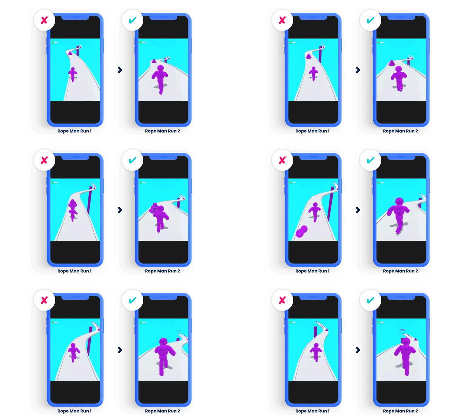
When designing creatives for the game Rope Man Run, we changed where the character was placed and how much of the screen they occupy. In the later, more successful version of the creative, gameplay takes up most of the frame and the character is depicted under the playable zone. Achieving the right ratio of environment to gameplay and placing the character in the playable zone makes it easier for users to understand the game.
Create contrast
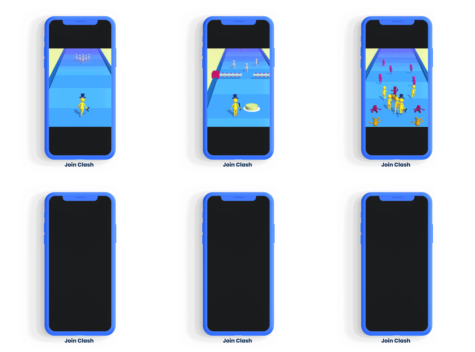
Now let’s talk about contrast. Heightening the contrast between the character and environment ensures they stand out and improves clarity of gameplay. In runners, for example, the running track could be a bright color and the character should be blue or another contrasting color. In Join Clash, we used a blue track and a bright yellow stickman that’s easy for users to see so they can understand the game more easily. Also note that the stickmen to avoid are in red, which is a common color users associate with danger. Applying color psychology like this to your character design can heighten clarity, too, because users naturally understand how to play your game based on these associations.
2. Get your UI right
Simple and clear UI helps users understand your game’s mechanics and how they can play. How all of your game’s elements appear, from your menu to the depiction of characters and obstacles on-screen, should feel seamless and guide users towards making the decision you want them to take.
Buttons, hand-pointers, and other icons can help clarify gameplay, especially in your tutorial and menu. For example, on your menu screen before users start playing, aim for a maximum of 3-4 buttons and use 1-2 colors to avoid cognitive overload and give players too many choices. Be sure to make the button that users press to start playing the biggest and brightest because that’s the one you want them to choose.
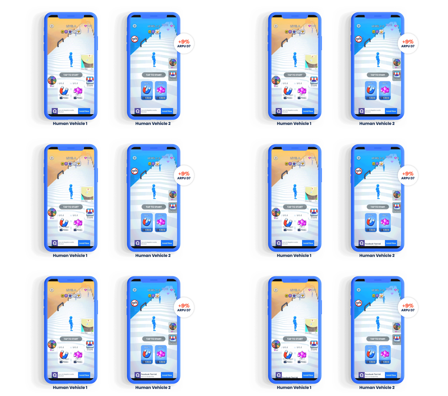
UI is important for later stages of publishing, too - when monetizing, good UI is crucial for improving the success of elements like rewarded video. The game Human Vehicles shows how UI changes can make a big impact on KPIs. We ran an A/B test on a new UI that rearranged the buttons on-screen, changed their sizes, and increased the contrast. The test showed the new UI increased D7 retention by 20% and boosted ARPU close to 5% (Find out more about key KPIs for testing your prototype in this blog). Once implemented to all users after the A/B test, the new UI led to a 9% uplift in D7 ARPU.
3. Get inspired by the art you see in the top hyper-casual charts
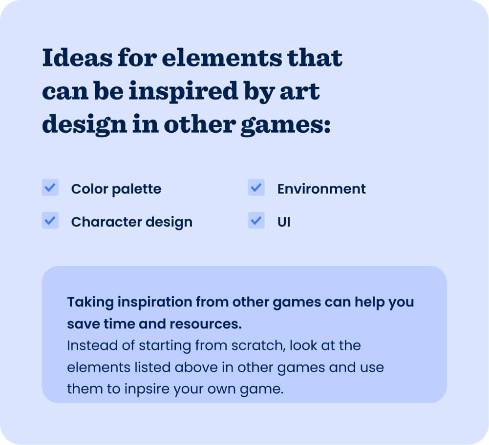
Don’t try to ideate your game’s entire art design from scratch - look at the games in the top charts and use their art to inspire your own game. This gives you a solid foundation to start with, saving valuable time and resources. It’s also likely that these art elements resonate with users and can make your game more clear because they’ve already proved they’re marketable and climbed the charts. Love the color palette used in the #3 hyper-casual game? Use it as your starting palette for your prototype. Character design, environment, and UI are also helpful artistic elements to spot in other games and inspire your own. Once you confirm your concept has a low enough CPI, you can make adjustments to the art and hone it for your concept.
You can even take art inspiration from other platforms, like console or PC games. For example, Good Job! Game for Nintendo Switch clearly inspired the mobile game Staff! - Job Game by SayGames. Though they’re for two very different platforms, the games look very similar, sharing features like a similar color palette, simple stickmen characters, and on-screen layout. Executing successfully on the art style of the Switch game helped propel Staff to the top 10 simulation games on iOS in the US.
Clarity is key
The point of honing your prototype’s art is to make the mechanic, gameplay, and goal more clear. At this stage of publishing, you’re only confirming your concept has legs by testing the CPI - don’t waste time designing intricate environments or detailed characters. Do, however, adjust your art to boost clarity, which is precisely where these tips come in handy. Have another art tip? We’d love to hear from you. Let us know on LinkedIn.
Let's put these tips to good use
Publish your game with Supersonic
