Simple controls, captivating art, and a strong theme - these are all features that help users understand your game’s concept, goal, and mechanic. Level design is another crucial piece of the puzzle. How your levels look and feel to users can help them better understand how to play and what they’re trying to achieve - which can often increase retention and playtime.
To improve level design - and in doing so, improve the clarity of your game - Suren Melkonyan, Game Designer at Supersonic, shares his top three tips that can encourage users to keep playing for longer.

1. Level environment and animations should work together to support your game’s concept
The environment and animations in each level should relate to one another to clarify your entire game concept. Going Balls, for example, has two levels with different environments: one is a city and the other is a forest.
In the city level, there are tall buildings and wide streets that are immediately recognizable as urban elements. They’re shown in a color that contrasts with the track so gameplay remains clear and obvious, yet immerses users in the level’s theme with the design in the background. The forest level shows a background with green trees and a blue river that clearly relates to a natural environment - and still highlights gameplay. These two levels include art design that feels intuitive - a city should have tall buildings and a forest should have trees and rivers. And they’re accessible to all audiences because every user can recognize a city and a forest. Remember: hyper-casual users are everyone. Your level should include an environment and animations that are accessible and easy to recognize no matter who’s playing your game.
Speaking of animations, they can support gameplay clarity, too. In Giant Wanted, levels include animations of stickmen on the street running away from the giant.
They make the goal of the game (kill the giant) clear - seeing people run away in fear is a clear sign the thing they’re fleeing from is an enemy. These animations also support the city environment because the stickmen are running through the streets and between buildings. The animations in the levels work together with the environment to support the game concept and improve clarity.
2. Structure levels based on your game’s genre
Users behave differently in different game genres. For example, they play hyper-casual ASMR games to feel relaxed, and play puzzle games to feel accomplished and challenged.
Anticipating how users want to interact with your game can help you structure levels that fulfill their needs and encourage them to keep playing.
Your level design should tap into this user psychology. Anticipating how users want to interact with your game can help you structure levels that fulfill their needs and encourage them to keep playing. Let’s take a look at one hyper-casual genre, in particular: idle arcade.
Idle arcade
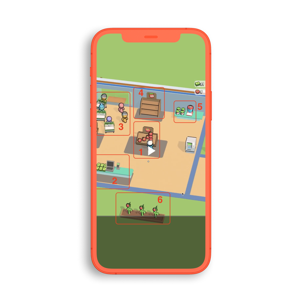
Players of idle arcade games are looking to feel a sense of progression as they collect resources, spend them on upgrades, and continue the cycle to build up their mini mart, farm, restaurant, etc. For users to understand this cycle better and clearly see which resources they should be collecting, the game levels should incorporate many elements and items within a small space
My Mini Mart does this by showing six elements within a single scene. This makes it faster for players to complete actions, which moves gameplay forward and keeps users playing for longer. As shoppers come into the mart (element 3 on the image below), users must take action - this is another way to propel the game forward and enhance the feeling of progression. Packing a lot of elements into a small space also improves clarity because users can see the resources they should be collecting and where to place them.

3. Use data to optimize your design
Level dropoff is the most important metric to analyze so you can improve your hyper-casual game’s level design. It indicates the percentage of users who failed to complete a given level, ultimately telling you where in your game users are dropping off. Then you can identify what’s different in the level and address the issue.
Level dropoff is the most important metric to analyze so you can improve your hyper-casual game’s level design.
Often, users failing to understand how to play a level or its objective leads to a high dropoff rate. You can solve these problems in your tutorial level - including even two separate tutorial levels could help. The first tutorial can be a quick, static level with a pointer that shows users how to control the game and what the objective is. The second can highlight a specific feature - like a multiplier gate - so when users see this in a level, they know how to use it to their advantage to pass the level. Both tutorials help accomplish the main goal: keep users playing.
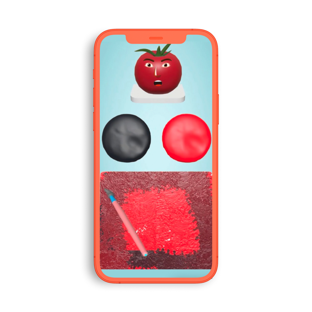
Looking at level dropoffs for Color Match, it was clear that many users weren’t getting past level 1. They were spending over 500s on this level, which indicated they didn’t understand how to play or the goal of the level. Turning level 1 into a simple tutorial level with just 2 colors instead of 3 made both the controls and objective of the game more clear.

Users are given a score based on how accurately they match the color to the object. So at this tutorial level, if players reach a certain percentage of accuracy, they can move onto the next level that’s more difficult - it has 3 colors. Introducing the tutorial and the rules around passing it ensures users know how to play and gives them an opportunity to move onto the next level and keep playing. This helped reduce the dropoff rate and encourage higher retention.
Clarity in all things
Hyper-casual games need to be as clear as possible - from the tutorial to the art design. Since users only play for 2-3 minutes a time, you need to grab their attention, make it clear how to play, and ensure they know what the goal is of your game. Improving your level design so gameplay feels intuitive and matches what users are expecting can go a long way to enhance this clarity. Take the tips above and apply them to your own game - with the right implementation and optimization, you’re more likely to boost crucial in-game metrics, like retention and playtime.
Let's put these tips to good use
Publish your game with Supersonic


