Failing a test can be a hard pill to swallow - we know it’s true. But here’s the thing - it’s actually an advantage that a high CPI is the main reason your hyper-casual game fails to pass the marketability test, because there are tangible actions you can take to lower the CPI of your next prototype.
Keren Barkay, Publishing Manager at Supersonic, is on the front lines of reviewing games submitted for testing and providing feedback based on the results. Here, she shares the most common reasons a game might have a high CPI and fail the first marketability test. Knowing these reasons can help you optimize your game before you submit it for testing and then confirm more quickly if the concept has marketability potential.
The marketability test video
There are a lot of moving parts that make up a video for marketability testing, and each of them can lead to a high CPI. However, many of these elements are easy to test and adjust to find the winning combination. Let’s start with the basics - the technical specs of your videos.
Design specs
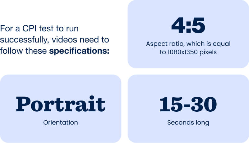
Your videos need to be the right size, length, and orientation - if they’re not, that’s a quick path to failing the test because they won’t fit the platform’s placement specifications and the resolution will be poor. If your video doesn’t appear clear, users won’t engage with it and platforms won’t show it to more audiences, which all leads to higher CPI. Luckily, it’s easy to get the formatting right because Facebook and TikTok publicly shares their specifications for videos so they fit correctly with their placements:
- Portrait orientation
- Aspect ratio of 4:5 (1080x1350 pixels)
- Length of 15-30 seconds
How it looks
Videos must grab user attention and make it clear how your game is played by highlighting engaging parts of gameplay, the mechanic, and the goal of your game. If users don’t understand your game, CPI will likely be high, which leads to - you guessed it - a failed marketability test.
To improve the likelihood that your game will pass the marketability test, keep these best practices in mind for designing your videos:
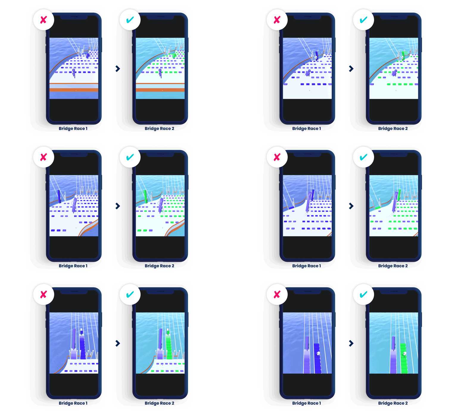
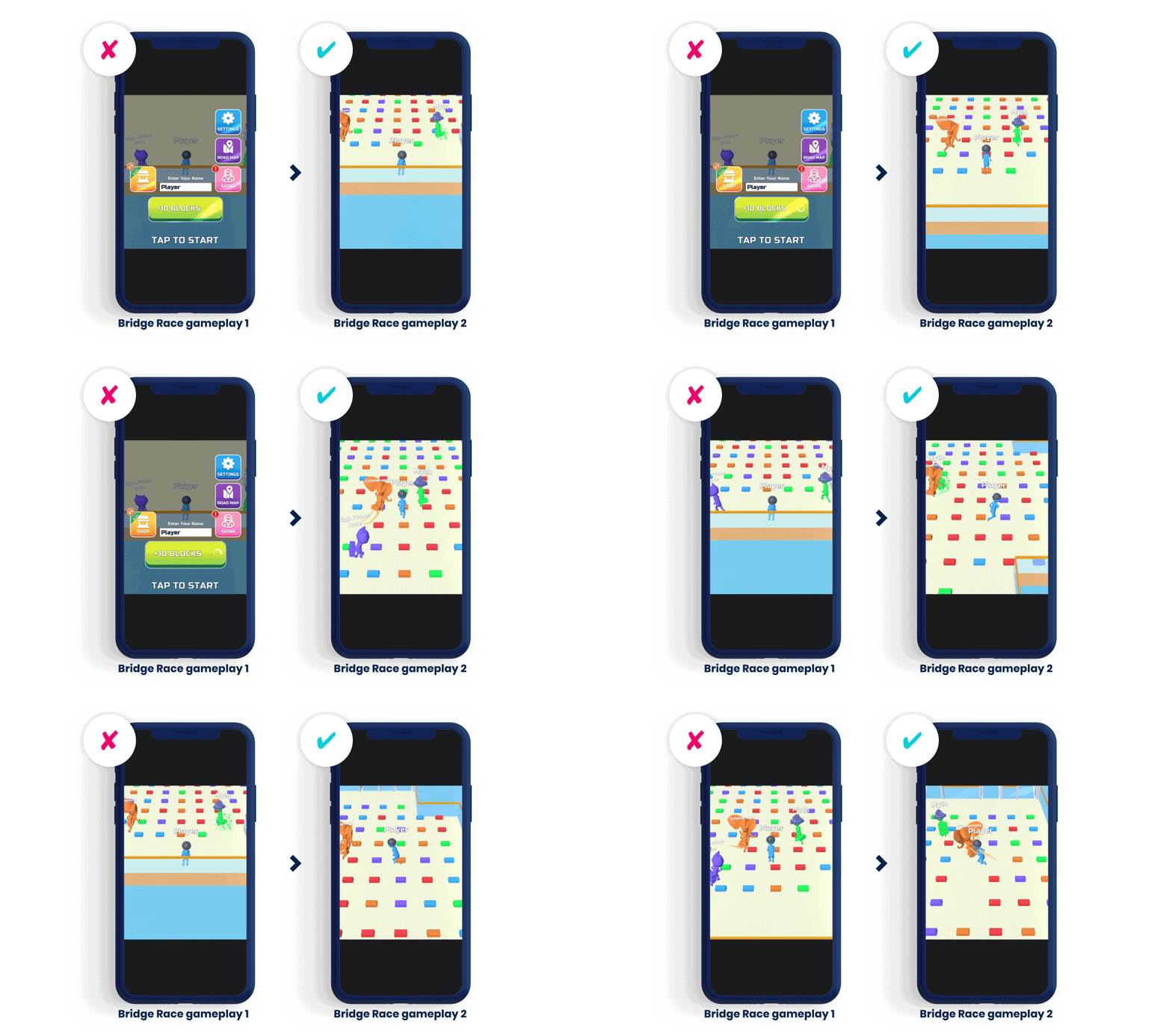
- Use bright, cartoonish colors. As this example from Bridge Race shows, on the left the colors are more monochromatic, using similar tones of blue and purple. On the winning version shown on the right, the video uses contrasting purple and green for gameplay and a light blue for the environment. The contrast improves clarity, which often helps lower CPI to pass the test.
- Place characters in the playable zone. This is the part of the screen where users control the characters.
- Start gameplay immediately. Like the example below - again from Bridge Race - the version on the left shows a menu and instructions before starting to play. The winning CPI video on the right launches immediately into gameplay, which engages users better and decreases CPI so you can pass the marketability test.
- Follow the right ratio. Make gameplay 2/3 of the video and the background 1/3.
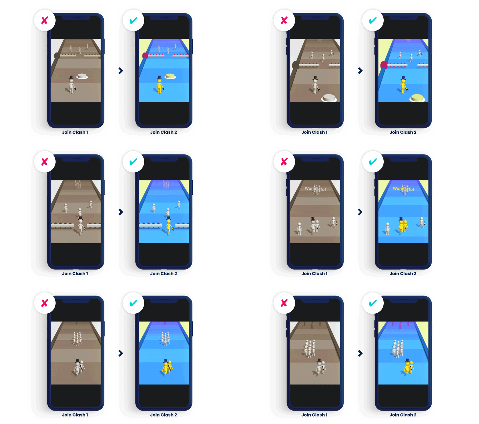
- Create contrast. Use colors that create contrast between key elements, like characters and environment. A marketability test video from Join Clash shows the lack of contrast on the left when sepia tones are used. Designing the track in blue tones and the characters in yellow, red, and white, ensures gameplay is clear and easy to see - this can help decrease CPI so you pass the test.
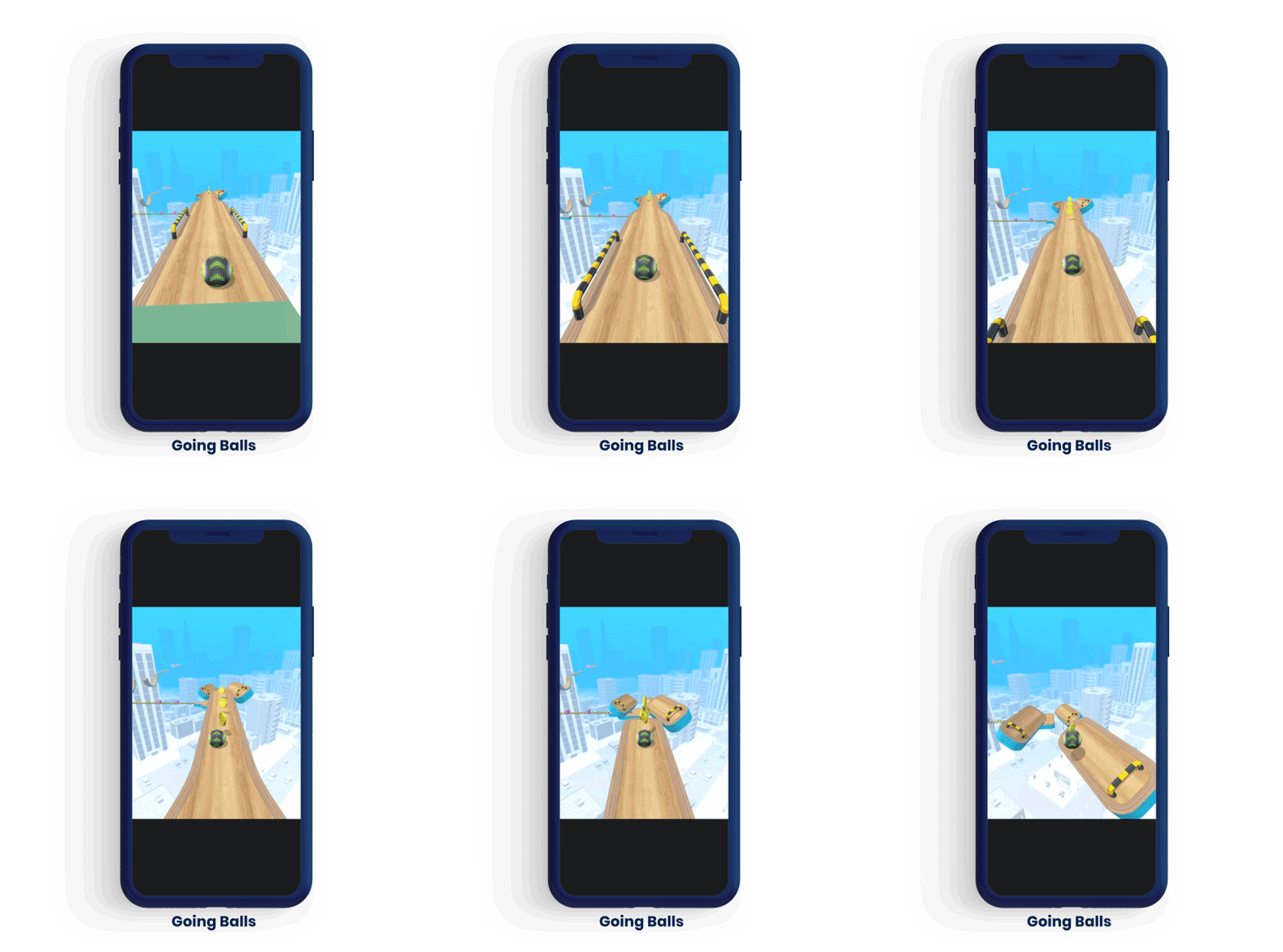
- Show the most interesting part of gameplay in the first 3-5 seconds. Waiting more than 5 seconds to get to the engaging part of gameplay will fail to hook users, leading to a higher CPI and failing the marketability test. For Going Balls, the video starts immediately with dynamic gameplay, like collecting coins and jumping from platform to platform. From the first prototype that was tested, the game was approved.
The game itself
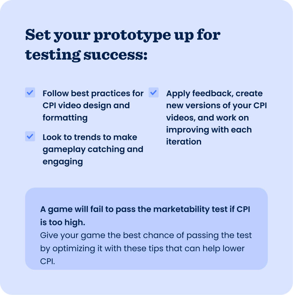
So you’ve honed your CPI videos to help your game pass the marketability test, but what about your gameplay? The first few levels you build out for your prototype can help lower CPI and signal to publishers that it has potential - gameplay should be catchy and engaging to help you pass the test. When CPI is close to the benchmark but not quite there, potential indicators of good in-game metrics like APPU, retention, and playtime (learn more about these key metrics in this blog post) can also be the final push in the right direction to pass the marketability test and start iterations.
The best way to make sure your gameplay is engaging depends on your game itself and the genre. Generally, trends are a good place to start: look at the trending mechanics in the top charts and use those to inspire your prototype. But don’t just take a trending game template and create a game without thinking it through. At Supersonic, we see plenty of games submitted in a trending genre - like idle arcade right now - but they don’t have a goal. Creating a game just because it’s a trendy genre won’t lead to a publishing agreement - you need a hook or another twist that makes it engaging.
Creating a game just because it’s a trendy genre won’t lead to a publishing agreement - you need a hook or another twist that makes it engaging
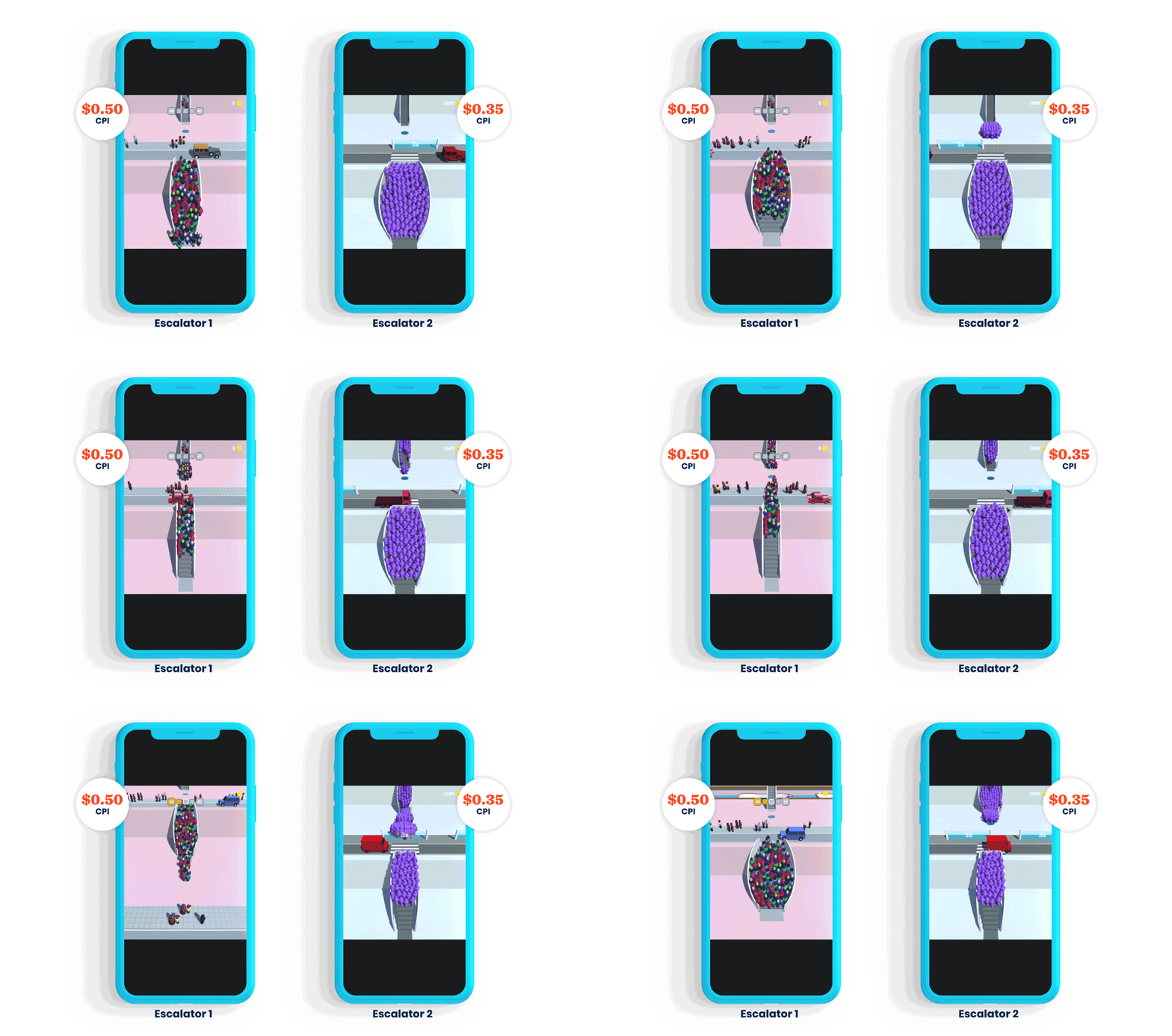
The top 20 game Escalators initially failed the marketability test due to a mechanic that led to high CPI, but changing the mechanic helped it pass the next time. The game originally used a collection mechanic that required users to hit crowds crossing the street to grow the number of people on their escalator. The CPI of this prototype was $0.50, and it failed to launch with another publisher.
Together with Supersonic, the developers changed the mechanic to multiplier gates after seeing it trending in the top charts. Now, users collect crowds by hitting multiplier gates instead of individuals, which makes gameplay more satisfying and engaging. The successful implementation of this mechanic, combined with the game’s clear goal, engaging design, and enticing hook that were represented in the marketability test videos, reduced the prototype’s CPI to less than $0.35 - the game got the green light to move onto the next stage of publishing and went on to reach the top 20 in both app stores with significant profit.
The approach
You matter to the publishing process, too. Your abilities and approach to development are crucial to whether your game - or the next ones you design - passes the marketability test. We often see developers submitting 4-6 of the same CPI videos - they fail the test each time because there’s no way to test different gameplay scenarios and versions that could resonate with users. Be willing to work on your prototypes, create new versions of videos, and improve with each iteration - that means applying feedback if it’s provided and doing your homework. Try looking at the top charts and running a market analysis, be proactive in asking for feedback, and check out resources like this blog on ideation tips for prototyping.
The developers behind Elemental Master took feedback from the Supersonic team during the testing phase that helped them achieve a CPI of $0.26 after getting rejected by another publisher. Early versions of their game had too high a CPI to pass, but after submitting their prototype to Supersonic, they received feedback that they integrated quickly and efficiently. Proving their abilities to collaborate and make changes helped ensure their game got approved, and it went on to reach the top 10 on both iOS and Android in the US.
Setting your game up for a low CPI
The fact is, if your concept has a very high CPI but gameplay and video elements - like the ones we’ve covered here - are in good shape, then there’s almost no amount of work that can be done to reduce CPI to a level that lets you scale affordably. When that happens, it’s time to move onto the next prototype. However, these tips are an excellent starting place to try and avoid the common pitfalls of games in the testing phase. Keep them in mind as you continue to grow your skills and build great games - we can’t wait to see your next prototype.
Let's put these tips to good use
Publish your game with Supersonic
